


there are many flex box property let me show you one by one
Flexbox is advanced version of display: inline-block Not so Advanced but also make very flexible and easy work don by display:Flex
lets take example and explain every functionality of flex-box
CODE
<style>
.container{
background-color: pink;
height: 50vh;
width: 50vw;
padding: 0.5em;
margin: 25vh auto 0;
}
.item{
background-color: lightblue;
margin: 0.5em;
}
</style>
</head>
<body>
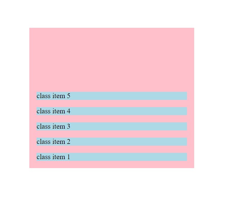
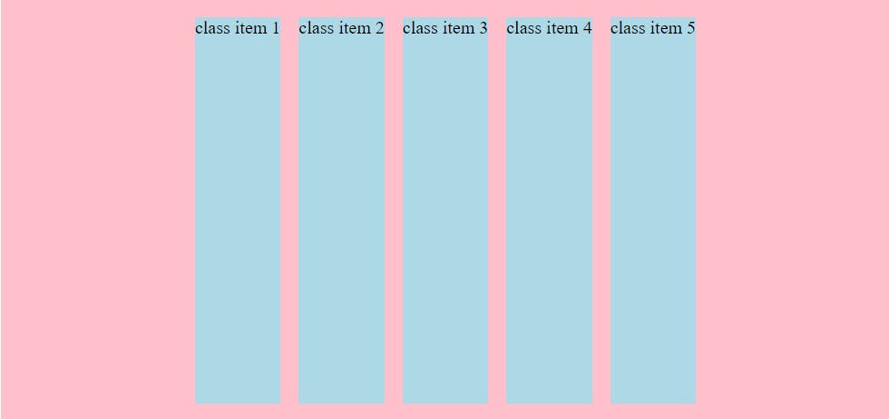
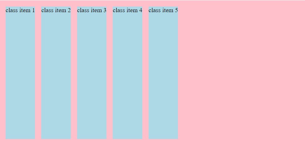
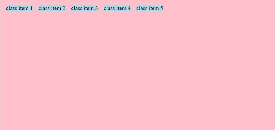
<div class="container">
<div class="item">class item 1</div>
<div class="item">class item 2</div>
<div class="item">class item 3</div>
<div class="item">class item 4</div>
<div class="item">class item 5</div>
</div>
</body>
OUTPUT

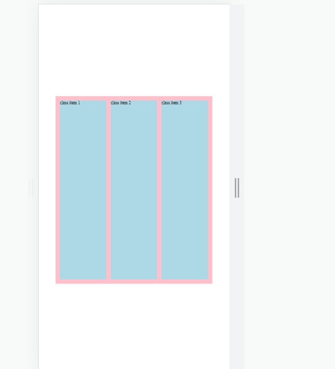
FLEXBOX CONTAINERS
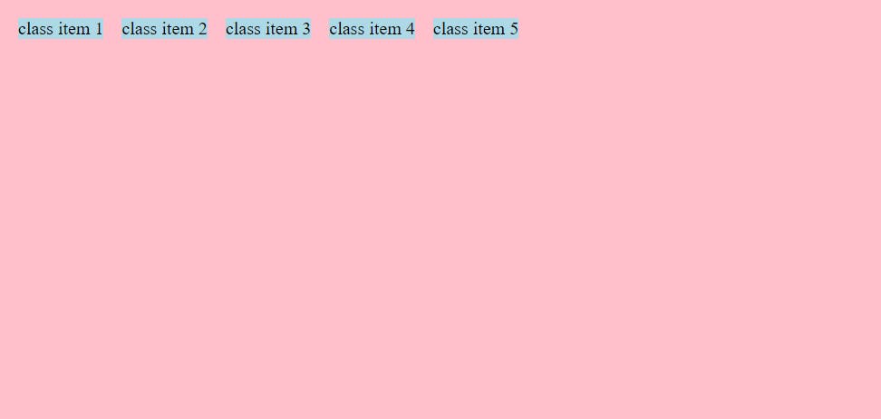
1.Flex-direction:
- its gives basically your flex-item a starting direction
Flex-direction :row
- its default version CSS for browser
CODE
<style>
        .container{
            background-color: pink;
            height: 50vh;
            width: 50vw;
            padding: 0.5em;
            margin: 25vh auto 0;

            display: flex;
            flex-direction: row;
            /* default on applying flex */
        }
        .item{
            background-color: lightblue;
            margin: 0.5em;
        }
    </style>
OUTPUT
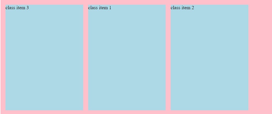
Flex-direction:row-reverse
its just like work as float : right
its first item is going in the last and start from to right side
CODE
<style>
        .container{
            background-color: pink;
            height: 50vh;
            width: 50vw;
            padding: 0.5em;
            margin: 25vh auto 0;

            display: flex;
            flex-direction: row-reverse;
        }
        .item{
            background-color: lightblue;
            margin: 0.5em;
        }
    </style>
OUTPUT
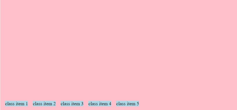
Flex-direction:column
- in this all the item get back to column way as just like start
CODE
<style>
        .container{
            background-color: pink;
            height: 50vh;
            width: 50vw;
            padding: 0.5em;
            margin: 25vh auto 0;

            display: flex;
            flex-direction: column;
        }
        .item{
            background-color: lightblue;
            margin: 0.5em;
        }
    </style>
OUTPUT
flex-direction:column-reverse
- its first item is going in the last and start from to bottom side
CODE
<style>
        .container{
            background-color: pink;
            height: 50vh;
            width: 50vw;
            padding: 0.5em;
            margin: 25vh auto 0;

            display: flex;
            flex-direction: column-reverse;
        }
        .item{
            background-color: lightblue;
            margin: 0.5em;
        }
    </style>
OUTPUT
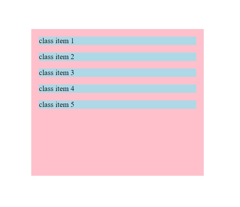
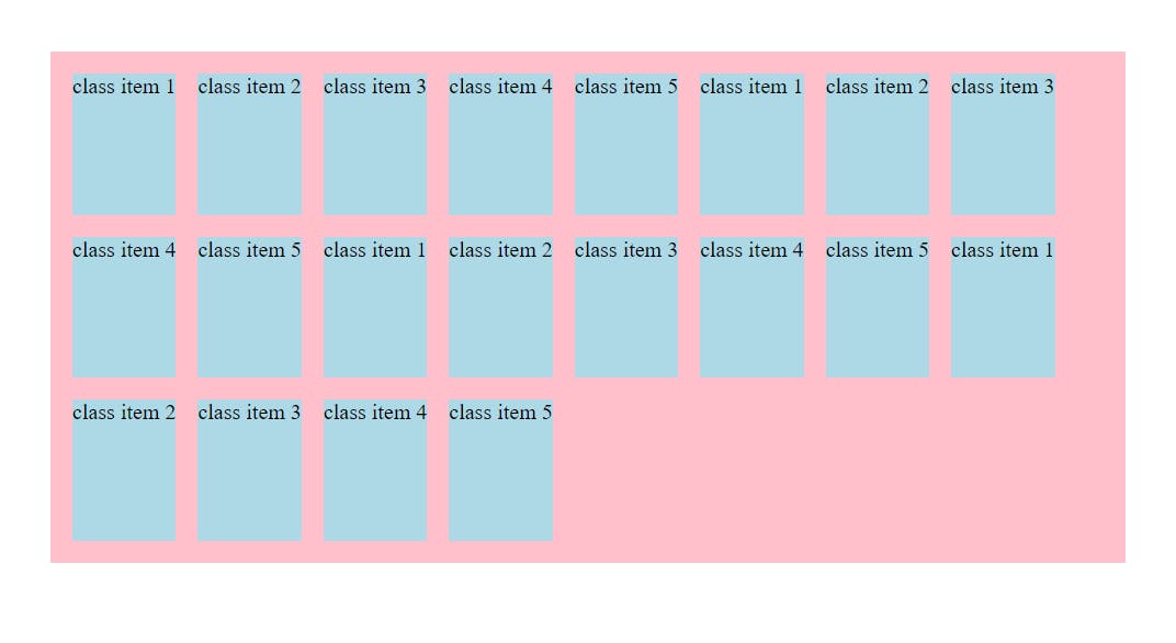
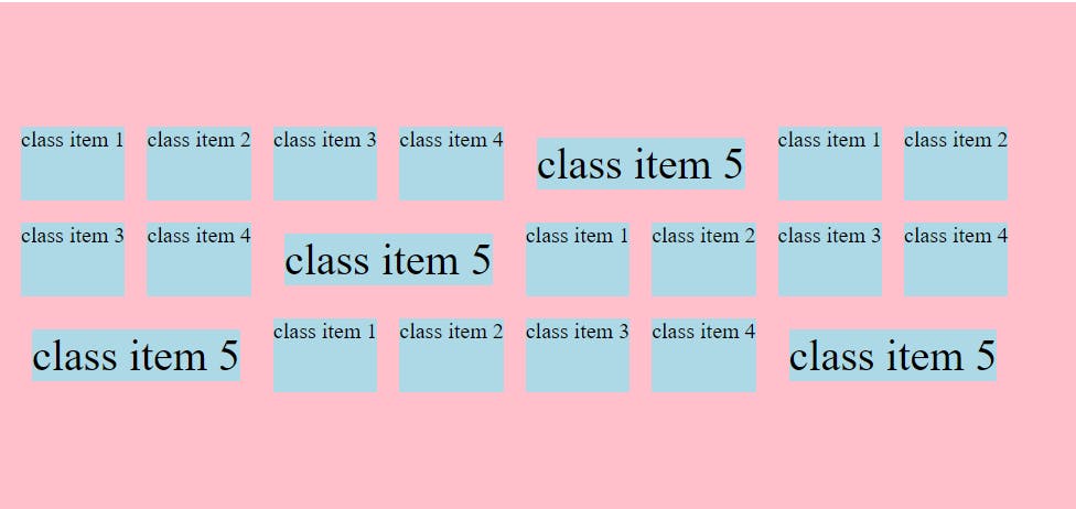
flex-Wrap
wrap
- or this overflown situation will be solved by this wrap. means they manage all items wrapped in the container:
1.flex-wrap:nowrap
so here by default the flex-wrap is no wrap and the item will be overflown
and they try as small as can flex-wrap
CODE
<style>
        .container{
            background-color: pink;
            height: 50vh;
            width: 50vw;
            padding: 0.5em;
            margin: 25vh auto 0;

            display: flex;
            flex-direction: row;
            flex-wrap: nowrap;
        }
        .item{
            background-color: lightblue;
            margin: 0.5em;
        }
    </style>
</head>
<body>
    <div class="container">
        <div class="item">class item 1</div>
        <div class="item">class item 2</div>
        <div class="item">class item 3</div>
        <div class="item">class item 4</div>
        <div class="item">class item 5</div>
        <div class="item">class item 1</div>
        <div class="item">class item 2</div>
        <div class="item">class item 3</div>
        <div class="item">class item 4</div>
        <div class="item">class item 5</div>
        <div class="item">class item 1</div>
        <div class="item">class item 2</div>
        <div class="item">class item 3</div>
        <div class="item">class item 4</div>
        <div class="item">class item 5</div>
        <div class="item">class item 1</div>
        <div class="item">class item 2</div>
        <div class="item">class item 3</div>
        <div class="item">class item 4</div>
        <div class="item">class item 5</div>
    </div>
</body>
OUTPUT

2.flex-wrap : wrap
CODE
    display: flex;
            flex-direction: row;
            flex-wrap: wrap;
OUTPUT
note: to wrap up items in container using width is also applicable
there is always messed up between
justify-content, align-items, align-content so bare with me till end
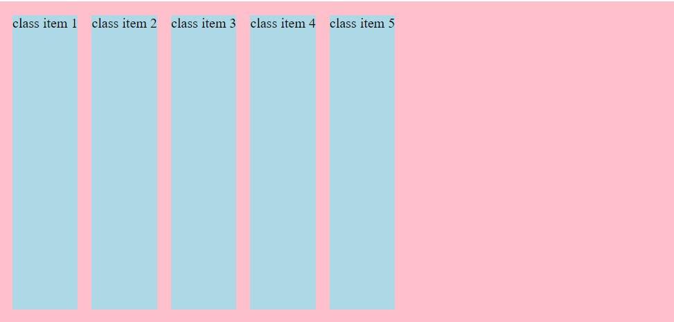
justify-content
Remember justify-content is always target in main axis
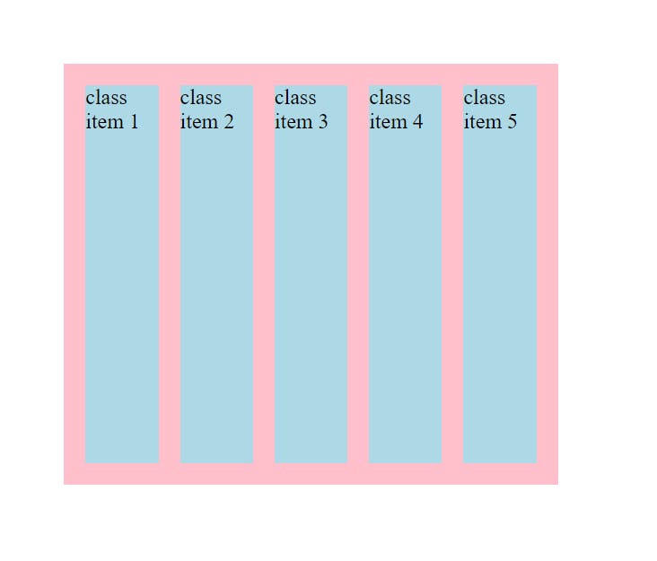
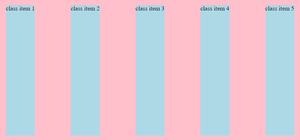
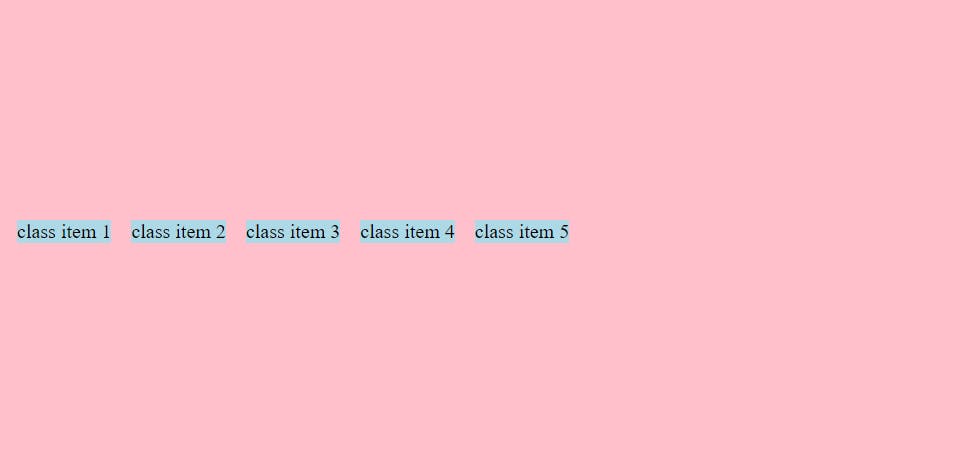
1.justify-content:flex-start;
- get all container items in start of container
**code**
<style>
                display: flex;
                justify-content: flex-start;
</style>

<body>
    <div class="container">
        <div class="item">class item 1</div>
        <div class="item">class item 2</div>
        <div class="item">class item 3</div>
        <div class="item">class item 4</div>
        <div class="item">class item 5</div>
    </div>
</body>
output
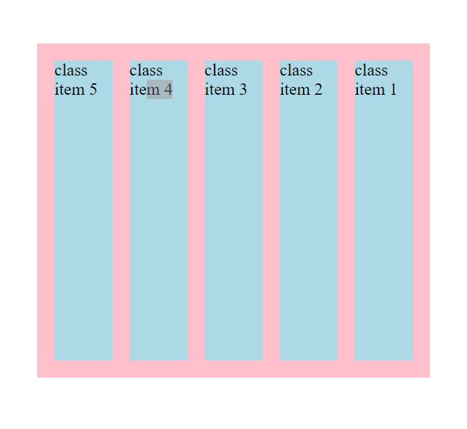
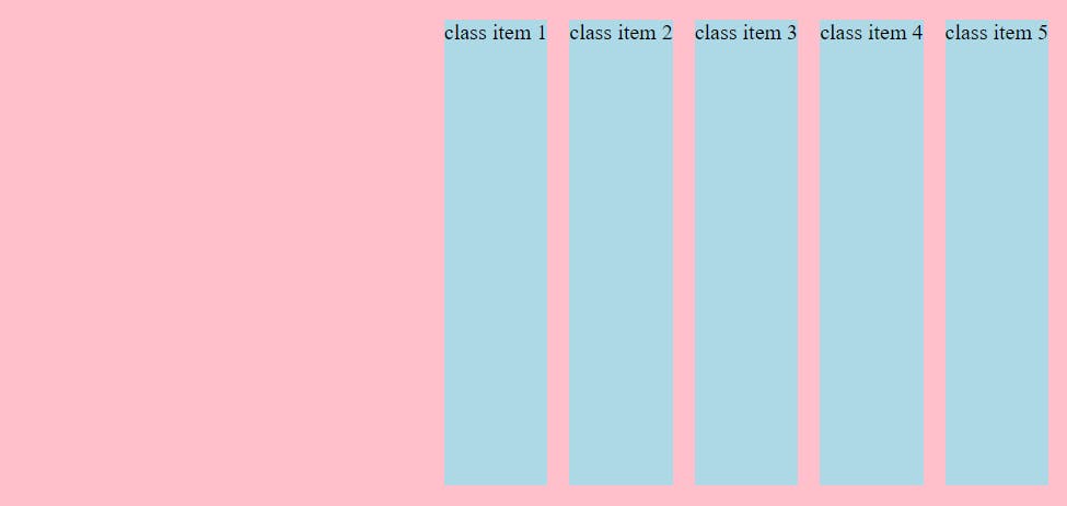
2.justify-content:flex-end;
- get all container items in end of container
CODE
<style>
                display: flex;
                justify-content: flex-end;
</style>

<body>
    <div class="container">
        <div class="item">class item 1</div>
        <div class="item">class item 2</div>
        <div class="item">class item 3</div>
        <div class="item">class item 4</div>
        <div class="item">class item 5</div>
    </div>
</body>
OUTPUT
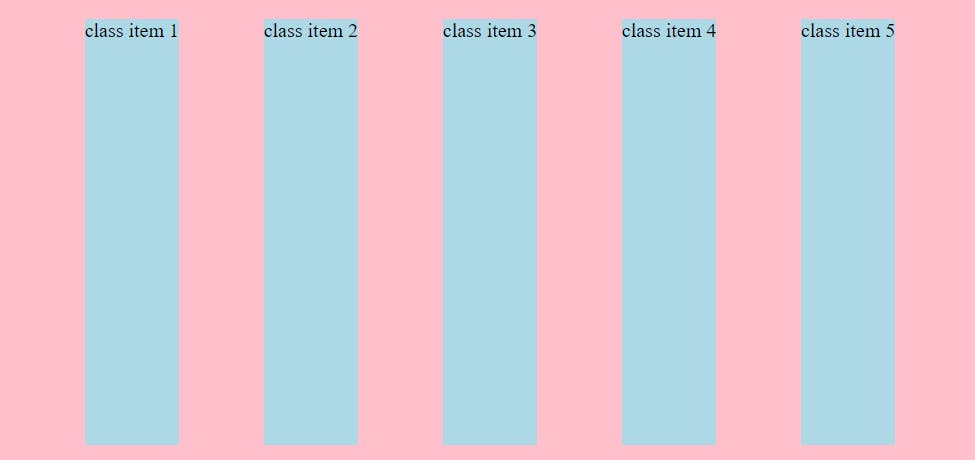
3.justify-content:center;
- get all container items in center of container
CODE
<style>
                display: flex;
                justify-content: center;
</style>

<body>
    <div class="container">
        <div class="item">class item 1</div>
        <div class="item">class item 2</div>
        <div class="item">class item 3</div>
        <div class="item">class item 4</div>
        <div class="item">class item 5</div>
    </div>
</body>
OUTPUT
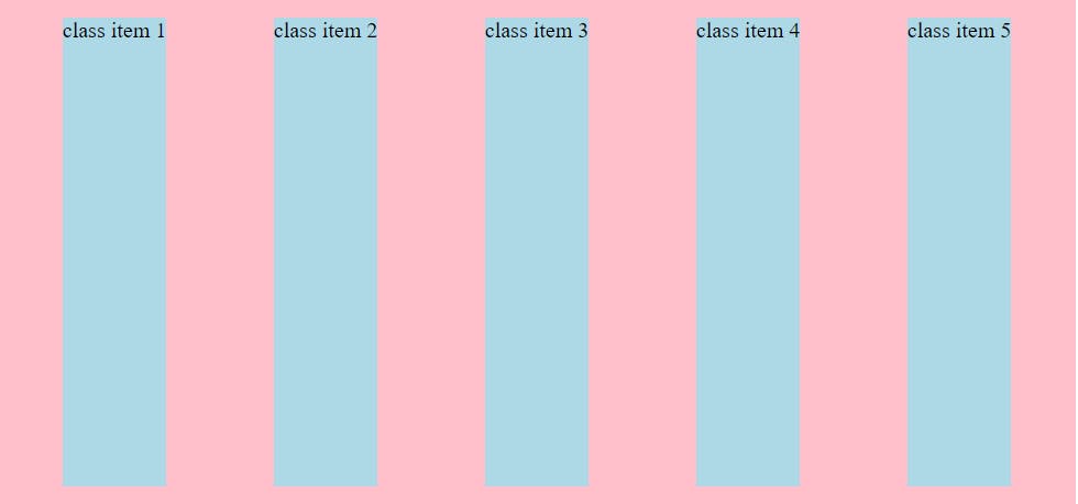
4.justify-content:space-between;
- get all container items where space is between with corresponding all items of container
CODE
<style>
                display: flex;
                justify-content: space-between;
</style>

<body>
    <div class="container">
        <div class="item">class item 1</div>
        <div class="item">class item 2</div>
        <div class="item">class item 3</div>
        <div class="item">class item 4</div>
        <div class="item">class item 5</div>
    </div>
</body>
OUTPUT
5.justify-content:space-evenly;
- get all container items where space is evenly with corresponding all items of container
CODE
<style>
                display: flex;
                justify-content: space-evenly;
</style>

<body>
    <div class="container">
        <div class="item">class item 1</div>
        <div class="item">class item 2</div>
        <div class="item">class item 3</div>
        <div class="item">class item 4</div>
        <div class="item">class item 5</div>
    </div>
</body>
OUTPUT
6.justify-content:space-around;
get all container items where space is around with corresponding all items of container
equal amount of space around each items in container
CODE
<style>
                display: flex;
                justify-content: space-around;
</style>

<body>
    <div class="container">
        <div class="item">class item 1</div>
        <div class="item">class item 2</div>
        <div class="item">class item 3</div>
        <div class="item">class item 4</div>
        <div class="item">class item 5</div>
    </div>
</body>
OUTPUT
NOTE: if flex-direction is column then the all this 6 functionality work same ……so always remember justify-content is work on main axis .
(main axis = flex-direction for justify content)
Align-items
- its target on cross axis i mean its target on y axis
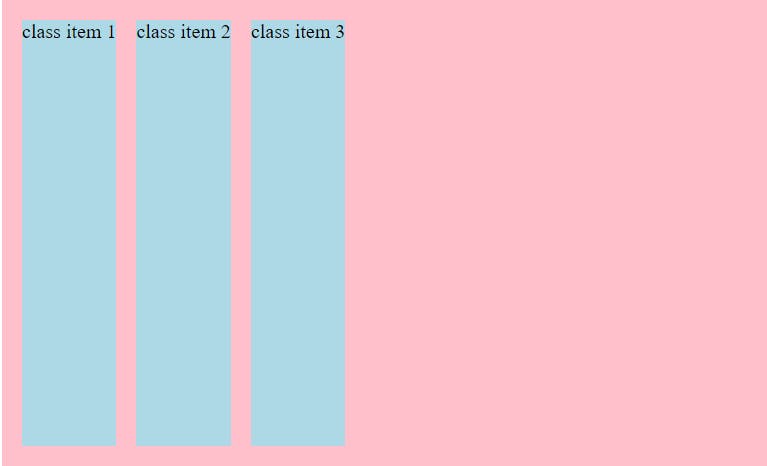
1.align-items:stretch
- its default for the align-items
CODE
display: flex;
            flex-direction: row;
            justify-content: flex-start;
            align-items: stretch;
OUTPUT
1.align-items:flex-start
- its take width and height to fit content and going in the starting of the container
CODE
    display: flex;
            flex-direction: row;
            justify-content: flex-start;
            align-items: flex-start;
OUTPUT
2.align-items:flex-end
- its take width and height to fit content and going in the ending of the container
CODE
            display: flex;
            flex-direction: row;
            justify-content: flex-start;
            align-items: flex-end;
OUTPUT
3.align-items:center
- its take width and height to fit content and going in the center of the container
CODE
            display: flex;
            flex-direction: row;
            justify-content: flex-start;
            align-items: center;
OUTPUT
NOTE: if the flex-direction : column the same function use in column way just like justify -content depends on flex-direction .
WHEN use WHICH use justify-content or align-items ?
for the simple way try one then try another
but for the answer you have to used to with practise…..as time you will use align-item and as time you will use justify-content
4.align-items : baseline
- its take width and height to fit content and going in the baseline of the container
**CODE**
            display: flex;
            flex-direction: row;
            justify-content: flex-start;
            align-items: baseline ;
OUTPUT
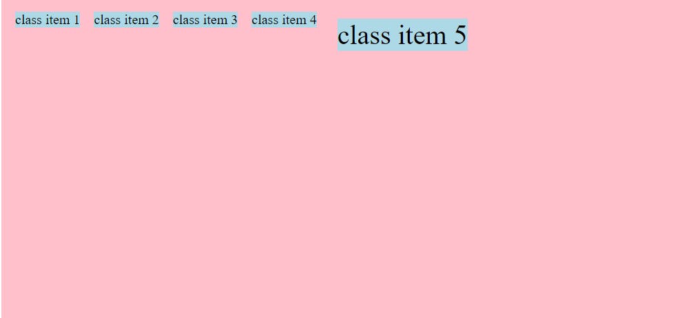
NOTE: for base line sometime u will highlight some navbar button and make it big but you also want your button get in one line for that time baseline comes in action
- while align-items: flex-start output
CODE
<style>
        .container{
            display: flex;
            flex-direction: row;
            justify-content: flex-start;
            align-items: flex-start;
        }
        .big{
            font-size: 2rem;
                    }
</style>

</head>
<body>
    <div class="container">
        <div class="item">class item 1</div>
        <div class="item">class item 2</div>
        <div class="item">class item 3</div>
        <div class="item">class item 4</div>
        <div class="item big">class item 5</div>
    </div>
</body>
OUTPUT
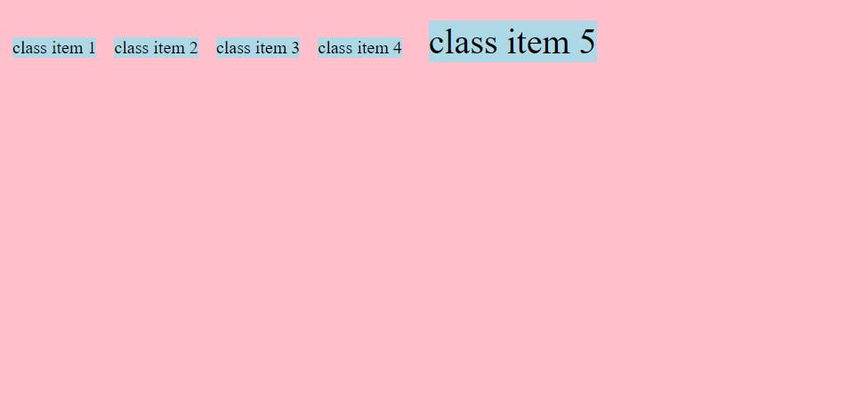
- while align-items: baseline output
CODE
<style>
        .container{
            display: flex;
            flex-direction: row;
            justify-content: flex-start;
            align-items: baseline;
        }
        .big{
            font-size: 2rem;
                    }
</style>

</head>
<body>
    <div class="container">
        <div class="item">class item 1</div>
        <div class="item">class item 2</div>
        <div class="item">class item 3</div>
        <div class="item">class item 4</div>
        <div class="item big">class item 5</div>
    </div>
</body>
OUTPUT
align-content
align-content have all the property which justify-content have
also align content have conflict with align-items
align-content only when you have multiple line of contents
1.align-content:
litterly everything you will use justify -content except space -evenly property .you will use in align-content
NOTE: what us difference between align-item and align content
align item will be the flex-start take all item into flex-start in which ever content they had
CODE:
align-item : center;
OUTPUT:
where align-content had take all items into center
CODE:
align-content : center;
OUTPUT:
FLEXBOX ITEMS
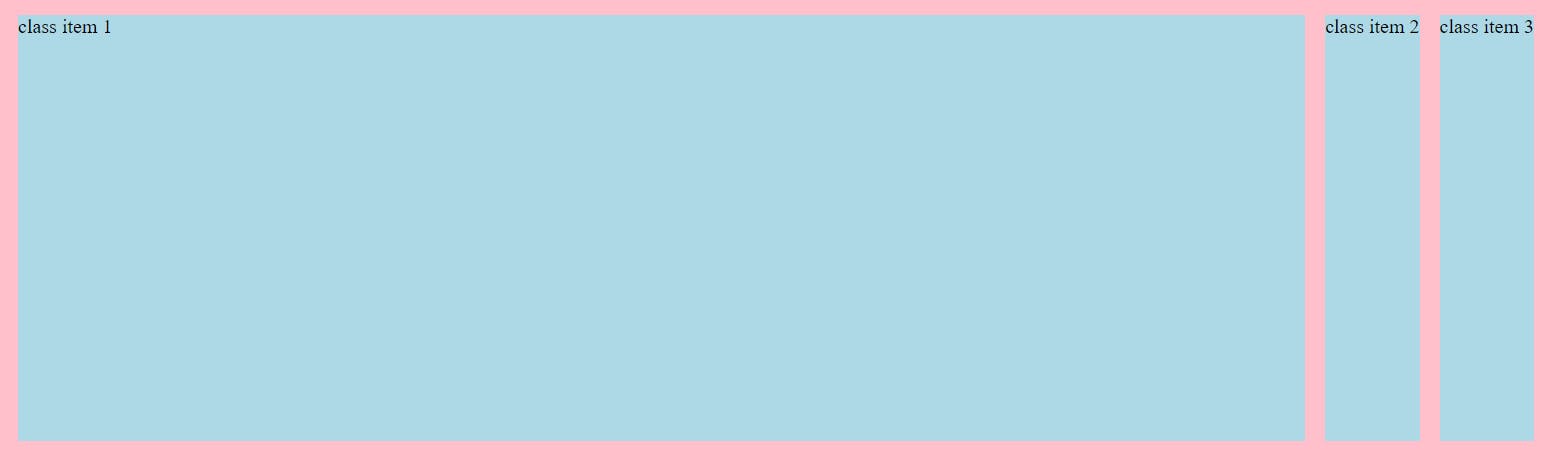
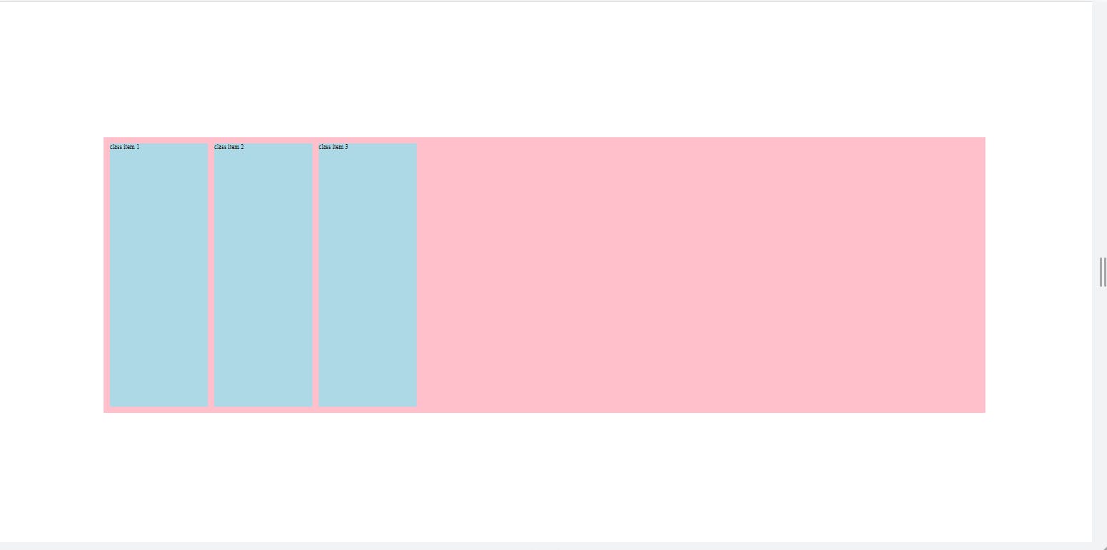
1.flex-grow
if you apply on any item flex-grow its default value is 0.tou can apply 1
so it takes the all maximum space in container as much as possible
HOW FAST ITS TAKES THE larger WITH DECIDE BY FLEX-GROW PROPERTY
### **flex-grow0️⃣**
<style>
         .container{
            background-color: pink;
            height: 50vh;
            width: 80vw;
            padding: 0.5em;
            margin: 25vh auto 0;

            display: flex;
            flex-direction: row;
        }
        .one{
            flex-grow: 0;
        }
        .item{
            background-color: lightblue;
            margin: 0.5em;
        }
    </style>
OUTPUT
flex-grow1️⃣
CODE
<style>
         .container{
            background-color: pink;
            height: 50vh;
            width: 80vw;
            padding: 0.5em;
            margin: 25vh auto 0;

            display: flex;
            flex-direction: row;
        }
        .one{
            flex-grow: 1;
        }
        .item{
            background-color: lightblue;
            margin: 0.5em;
        }
    </style>
OUTPUT
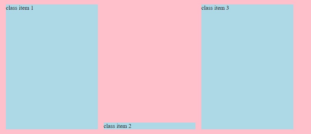
2.flex-shrink & flex-basis
FLEX-SHRINK :
how fast it takes to shrink its depend on flex-shrink property
so flex-shrink make the size of the flex shrink it can as much as possible
flex-basis the room of the size which is take by while flex-grow
when you give flex-grow a and give size with flex-shrink default value means your items are now flexible way better then anything .in whatever the the flex-basis size it takes
CODE
<style>
         .container{
            background-color: pink;
            height: 50vh;
            width: 80vw;
            padding: 0.5em;
            margin: 25vh auto 0;

            display: flex;
            flex-direction: row;
        }
        .one{
            flex-grow: 0;
            flex-shrink: 1;
            flex-basis: 250px;
        }
        .two{
            flex-grow: 0;
            flex-shrink: 1;
            flex-basis: 250px;
        }
        .three{
            flex-grow: 0;
            flex-shrink: 1;
            flex-basis: 250px;
        }
        .item{
            background-color: lightblue;
            margin: 0.5em;
        }
    </style>
OUTPUT
FLEX RESPONSIVE
OUTPUT
flex-grow & flex-shrink is totally opposite functionality.
but the more value its has the more faster it doing its functionality.
means flex-shrink :1 and flex-grow3 in corresponding two item .the more higher value functionality apply first
you can use shorthand for the flex-grow. flex-shrink. flex
flex-grow: 0;
flex-shrink: 1;
flex-basis: 250px;

FLEX:0 1 250
ONE IMPORTANT NOTE FOR FLEX SHORTHAND ITS THAT .
IF YOU WRITE ONLY FLEX:250PX (250px = random size) ITS ALREDY TAKEN FLEX:1 1 250PX MEANS ALREDY TAKEN
FLEX-GROW:1,
FLEX-SHRINK:1,
FLEX-BASIS:250PX;
ORDER
you can give order value -1,0,1,2 most of time.
because of this you can use the order of any items first and last by giving them order
by default its 0
but there is who is larger number in compare to other comes last …..vice versa more smaller then other then only comes first
    .one{
           flex:0 1 250px;
           ordeer: 2;
             }

    .two{
           flex:0 1 250px;
               }
   .three{
          flex:0 1 250px;
           order: 1;
            }
OUTPUT

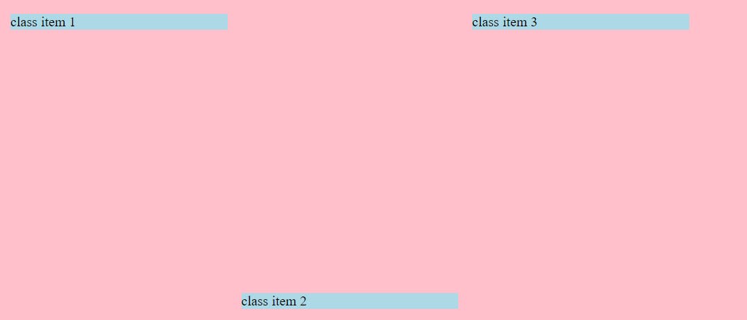
if I don’t give the any order to any item then give item 3 to -1 its comes first by (default its position its last)
Align-self:
align-self is use for the differently act any item in container
quite dependent on align-item property so be care of that too
if u want class item 2 in end of flex you will do like this
NORMAL OUTPUT

CODE
<style>
         .container{
            background-color: pink;
            height: 50vh;
            width: 80vw;
            padding: 0.5em;
            margin: 25vh auto 0;

            display: flex;
            flex-direction: row;
            align-items: flex-start;
        }
        .one{
            /* flex-grow: 0;
            flex-shrink: 1;
            flex-basis: 250px; */
            flex:0 1 250px;
        }
        .two{
            flex-grow: 0;
            flex-shrink: 1;
            flex-basis: 250px;
            align-self: flex-end;

        }
DESIRE OUTPUT
why align-self depends on align-item then check this example
we all know align-item will be default value stretch and no we apply align-self :flex-end
OUTPUT